June 11th 2024
Welcome to my weekly diary charting the ups and downs of turning my Victorian whodunnit, Octopus: Octavius Guy & The Case of the Throttled Tragedienne, into a podcast. I'm its author, Michael Gallagher. Beric Livingstone is its narrator.
Where Beric is at:
This week Beric sent me the revised version of Chapter 1. I realize that nearly week I say, "And it's fantastic!" but the truth is, it really is.
From Chapter 8, here Gooseberry meets Mrs Potts, Isabella Prynn's landlady, for the first time.
"I. Already. Have. A. Charwoman. Who. Does. For. Me. "
Learn more about Beric here:
Where I am at:
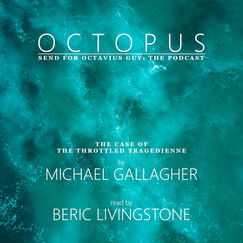
This week, more work on the cover art, in particular trying to choose the fonts I'll be using. I spent a couple of hours producing this, which I thought looked quite elegant:

Then I had the bright idea to take a quick gander at the covers on Audible. Oh my! The thumbnails are so small, not even my H1 title would be legible (case in point: the thumbnail on the bottom left). Time for a rethink!

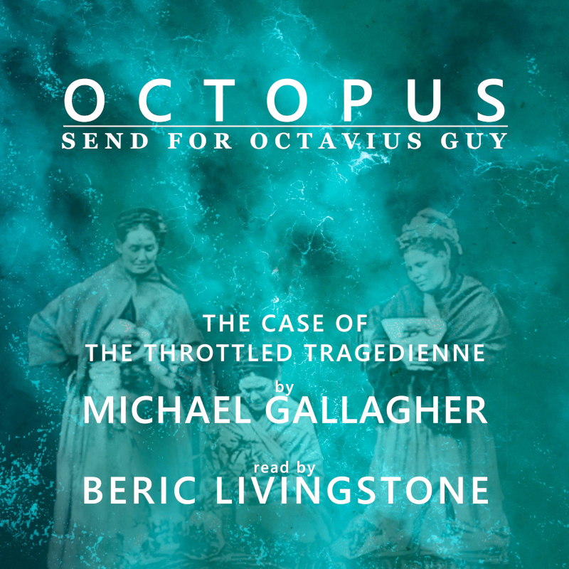
I tried adding in an element of the John Thomson image from the original cover. It turns out that it only really works with the turquoise background; the large number of tones helps to hide the paste job. The dark blue that some of you liked was far less forgiving. I've now pared down the text and thickened up the lettering.
I love the juxtaposition of sans serif and serif at the top for the H1/H3. The lower portion of the text (H3/H2) needs to stand out more, which could be achieved by the addition of a drop shadow from the lettering or a block of shadow that sits between the image and the text. I'm also considering adding a touch of colour.
If you are wondering how I arrived at the relative sizes for the headings, I used a standard design formula, where H3 is two-thirds the size of H2, which is two-thirds the size of H1.
I now have three ways I can go with the typography. I wonder which one you think works best?

TEST 1

TEST 2

TEST 3